Visual Design:
Shifting Context
For this project we had to shift the context using existing work and typography.
The main topic I picked was the Netherlands, and originally wanted to show contrasting things in the Netherlands, but later changed this to something else.
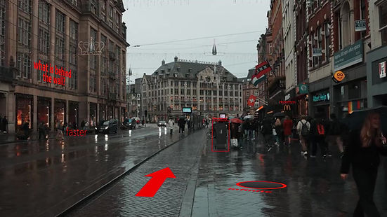
The concept was to show someone walking through a place like Amsterdam, and there would be the context of what is going on in their mind visualized using text, icons, symbols and shapes.
This is my original concept where I projected within the shape of the Netherlands and showed the two contrasts of beautiful nature and the less beautiful political landscape.
Im happy with how the sound for this iteration turned out because it clearly shows the contrasts and the transition effect works very well.

The main inspiration for my second iteration came from photos like this from the Chinese surveillance system, where everything and everyone is monitored. I liked the idea of having a normal situation flipped upside down by showing a bunch of text, statistics, shapes and basically changing it's context.


I learned a lot about After Effects, and mainly how to use 3D Cameras and place things in 3D space.
Reflection
I'm very happy with the progress I made in terms of what I learned in After Effects. I think that my story could be explained clearer and that the context shift can be done better, I think lighting could work very well here, especially since I use a bright red for the 'surveillance view', I think if I were to use light to show the difference between this view, and the normal view of Amsterdam it would already become a lot clearer.